
Teaching How to Monitor for Quality
Monitoring is not a word always embraced in the quality field. To some, it evokes images of Big Brother in the workplace. To others, the word feels paternalistic. Dad is keeping a watchful eye out on things. To others, especially those in the health services realm, it seems old-fashioned. The quality world in health has moved beyond quality assurance to the more glitzy world of quality improvement.
 But ask social service administrators or board members these questions, as I have.
“Would you like this agency to become more data-driven?”
“Would you like to be able to see, in metrics, how your agency programs are performing?”
“Would you like to be able to spot trends over time, in how they perform?”
The answers are almost always, Yes, please.” They are tired of describing their work in terms of numbers served. I tentatively started down this road professionally a few years ago, when a public agency administrator I respect told me, “Curtis, I think my employees would respond very well to data. I’d love for us to be a data-driven agency, but I have no idea where to start.” At that time, I myself had only vague ideas about how to help. As a social service researcher, this sounded like something I should know.
This year, I am teaching, as a pilot effort, a course in a school of social work called, Quality Monitoring and Improvement in the Social Services. The students are second year masters students, evenly split between those who want careers in direct practice and those who want careers in social service administration. We have completed the quality monitoring portion of the class and I thought I’d report on how it went, the challenges I faced and how the students fared on their major assignment related to monitoring. I finished this teaching module convinced more than ever that quality monitoring activities are a vital agency function and the skills associated with these tasks are important ones for agency-based quality professionals to possess.
Where to Start
Agencies need to start monitoring efforts with thoughtful planning about what is most important for them to measure. What outcomes? What processes are key to their success? What could get them in trouble if they didn’t follow? What is key to their survival?
In the real world, these efforts should be based on thorough strategic planning involving key administrators, board members and other important stakeholders. I wanted students to be thinking about real-life social service agencies and programs and deciding what should be monitored over time. This provided a teaching dilemma. This was not a class in strategic planning and we didn’t have time . For our purposes for learning in a class setting, students could ask their field instructors or employers for input, but they would have to make some of this up. I didn’t want these to decisions to come out of the blue, however, so I had them pick a social service program they knew well and create a few strategic planning exercises. I found excellent guidance on this in a book by Ron Person, Balanced scorecards and operational dashboards with Microsoft Excel.
- A SWOT analysis of the program’s strengths, weaknesses, opportunities and threats.
- A destination statement of where the program hopes to be.
- Three to four strategic themes that help differentiate this program from others. These are short, impactful phrases, that capture
- The designation of key perspectives from which to approach monitoring activities (for example, a consumer perspective, a financial stewardship perspective, an agency administrator perspective, a key stakeholder perspective, a staff learning perspective).
- A strategy map that shows the interplay between the themes and the key perspectives.
- And directional goal statements that derive from the strategy map.
Students then were forced to choose and justify five key metrics that are most important for their social service program to monitor over time. They could come from this mini-strategic thinking or they could come from outside it. But this process forced them to be thoughtful about what they would choose to monitor.
This part of the learning went well. Students dove into the process. They created destination statements and strategic themes that I would guess were better than what these programs were currently working from (if they had done any strategic planning at all). Their strategy maps were detailed and full of great ideas. In each case, students chose their metrics thoughtfully.
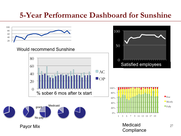
Creating Dashboards
Students were then charged with creating dashboards – visual presentations of data over time – using their chosen metrics, for audiences like a board of directors or agency administrators. These dashboards were to involve the multiple perspectives, be balanced, visually interesting, and use multiple visual formats (bar charts, line charts, pie charts, etc). Although there are now other products available for such purposes, I required the use of Microsoft Excel to conduct this assignment.
The charts the students created were beautiful. They were, however, too much like the samples I presented in class. But they clearly got the design concepts behind them.
Some students struggled with definition of the precise metric from a measurement tool. For example, a consumer satisfaction questionnaire of ten items, each scored on a likert scale of 1-5, could yield several metrics. They could plot over time: the mean score on a scale from 10-50; a median score; a mean item score; a median item score; the percentage whose mean item score was above a cut-off, say 4, representing “satisfied”; or even the results from a single item, measuring “overall satisfaction. A program evaluator would go with the mean or the mean item score in order to not lose information on variation. But a quality professional, eager to use the metric that best conveys to stakeholder audiences how things are changing over time may choose a different indicator, such as percentage of clients who have mean item scores greater or equal to four. This works because it is a metric that people can understand. It works because our goal is descriptive and to show change over time. It is not to explain variance. I don’t know if students caught the subtle difference here. But it led to a good discussion.
Data Collection
Students in the quality class have all had other research methods classes. I felt a need to revisit some concepts from measurement and survey design to help them understand how to create a monitoring plan for an agency. They had an assigned reading on chart review methods. I covered some survey design issues in class, mostly on writing good items and formatting surveys for good data entry. We looked at the online survey tool I use in my work, Qualtrics, to demonstrate what these sophisticated projects can do for the budding agency-based survey researcher. They provide excellent survey formatting options.
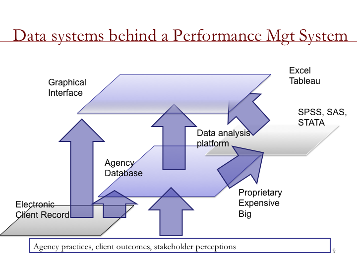
One struggle with teaching real-world quality monitoring for the social services is that social service agencies use all sorts of different data management software, mostly proprietary. There are levels to the data they have available to them and to the analytical tools they have to make sense from this data. I used this graphic to help explain my understanding of where agencies' data structures stand today.
Run Charts and Statistical Control Charts
In our survey work with quality professionals in social service agencies, professionals report they feel most inadequate about their statistical analysis skills. Truthfully, the skills needed for quality monitoring are descriptive and noting trends over time. The trick for the latter is to know when the data are showing real trends that indicate that processes have changed. Show trend lines to folks and they will tend to see trends that aren’t really there. What they are seeing is natural variation. Western Electric statisticians recognized this years ago and created rules for run charts that are still in use today. My impression is that students grasped the use of these rules once presented and discussed in class.
Statistical control charts add a different set of indicators to whether processes have changed, using data over time. Students found this a little more confusing. I used a reading from Statistical Process Control Demystified, but I am not sure that students found themselves demystified.
Control charts also require some revisiting of the concept of statistical variation. I forced them to hand calculate ANOVAs in class to re-familiarize themselves with how variation works to better understand upper and lower control limits and how they need to change in control charts to account for difference in sample sizes. The students suggested that the next time I teach the course, I present a screen capture video of me calculating ANOVAs in excel. I think this was an excellent idea.
I used the excel plug-in, SPC IV Excel, to create the control charts presented in class. I found it easy to use. I think the next time I teach this material, I will have students buy the $40 student version of the plug-in and make them create control charts of their own. While students learn that there are different ways to calculate the control limits based on the level of measurement used, I think requiring the students to see that they have to choose the right control chart type based on their measure will be useful. I think a screen capture example of me walking them through the creation of a control chart using SPC for Excel will also be very useful.

Student Assignment
The student assignment for this portion of class was to create and critique a monitoring plan for a social service agency. It contained the strategic planning elements described above, the visual dashboard, the underlying excel summary data, a justification of measurement choices and a critique.
Students clearly got how to choose good metrics. They understood the trade-offs involved. And, they comprehended that it is difficult to find metrics that get close to capturing the elusive nature of quality service.
For this assignment, I created a mock version of the assignment. Before class started, I hired a student not in the class to complete the assignment to help me gauge its feasibility. Then, I took her assignment and “fixed it” as I seemed necessary to create a model assignment. This was valued by the students. Otherwise, I am not sure they could have envisioned how all the parts fit together. From the student’s work, I now have an excellent example to use going forward.
Overall, I am pleased with how this first effort at teaching quality monitoring went. I learned some valuable things about what students were able to understand at first go-around and what they could not. This will be invaluable as I work to create training packages not only for our students, but for the larger social service field.
By putting this course together, I also realized that I do have the ability to convey to agency personnel how to make their agencies more data-driven. I can show them what that looks like. I can teach their quality professionals how to do it. The course forced me to sequence it in a way that makes it work. It helped me place big picture and small picture together on the same canvas. It was a valuable exercise for me as a quality professional.
Currently, I am teaching the quality improvement part of the course. I will let you know how that goes in a few weeks.
Note: If you buy a book from the Amazon links in this site, a small fee is returned to the site to help with the site's upkeep. -- Thanks